
12 min read
The Best Greige Paints for a Warm, Cozy Interior: Top Picks and Tips for a Welcoming Home


Edited by: Louise (Editor In Chief)
Fact/quality checked before release.
Fact/quality checked before release.
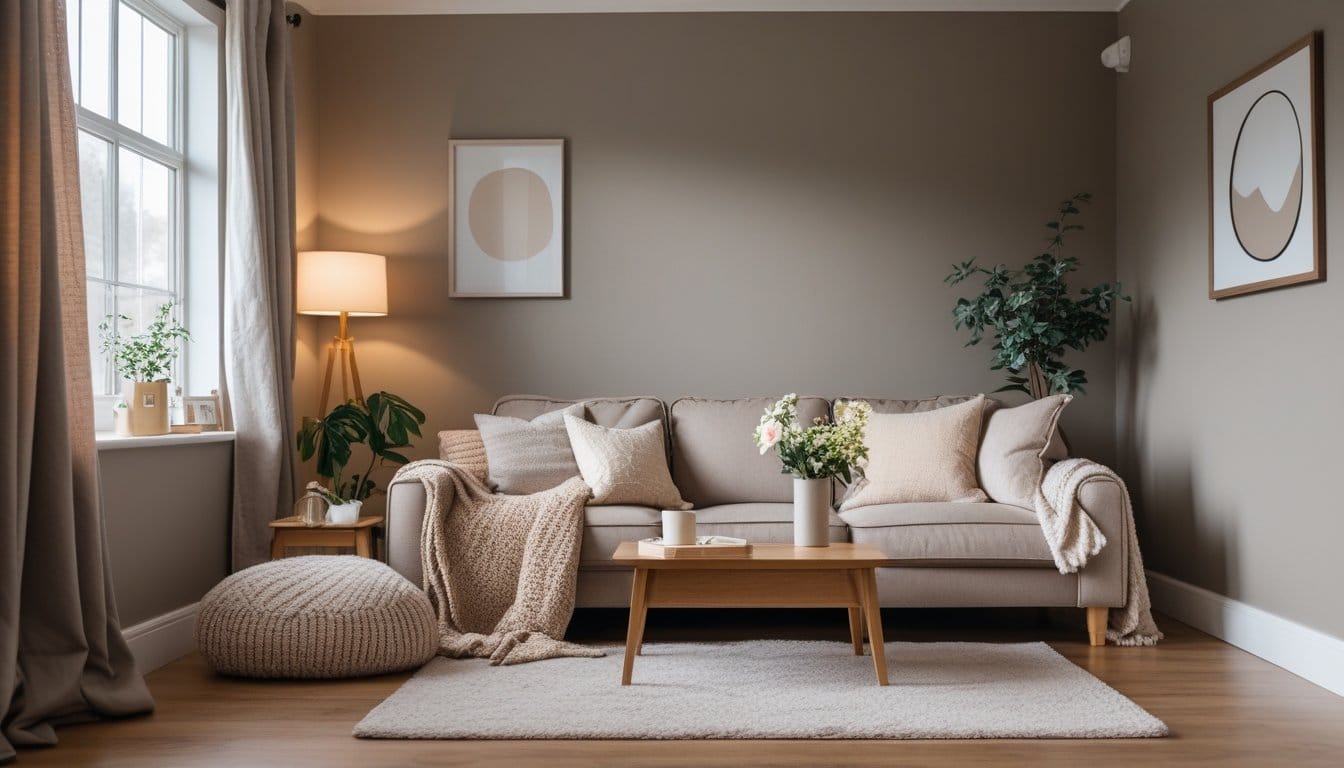
Looking to give your space that soft, inviting touch without going too gray or too beige? Greige paint offers a perfect balance of gray and beige, creating a warm, cozy atmosphere that works in almost any room. It’s versatile, pairs beautifully with different design styles, and gives your walls depth without feeling cold or bland.
Choosing the right greige is all about finding that just-right undertone—some have a hint of warmth to make large rooms feel snug, while others stay light enough to keep your home feeling open and airy. If you’re curious which greige paints designers and homeowners swear by, you’re in the right spot. You’ll discover shades that can help transform your living room, bedroom, or even hallway into a comforting retreat.
What Is Greige Paint?
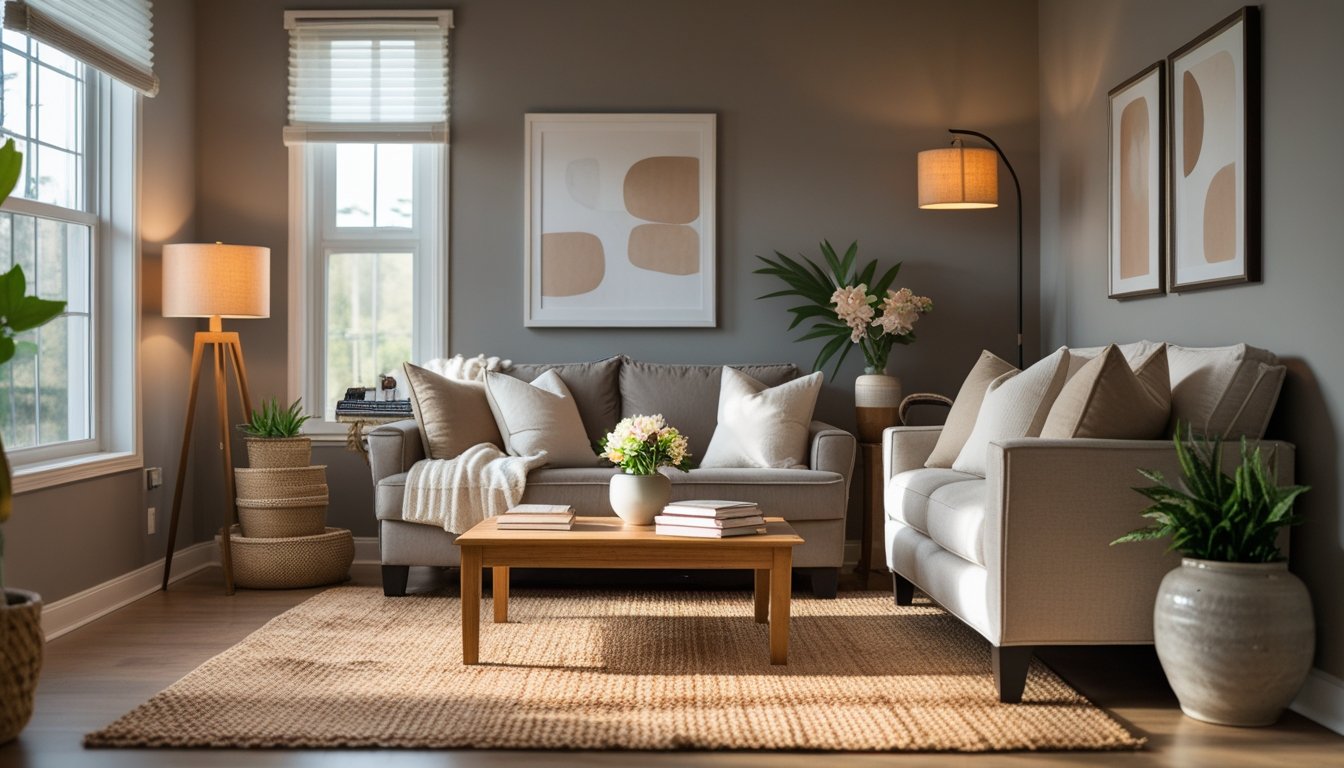
Greige paint blends the warmth of beige with the cool undertones of gray, creating a flexible color that adapts to many spaces and styles. It’s a popular choice if you want a neutral that feels both modern and inviting.
Understanding the Greige Color Palette
Greige sits right at the crossroads of gray and beige, giving you a neutral that’s not too cold and not too warm. When you look at a greige swatch, you’ll see hints of both: that cozy beige and that sleek gray, all in one balanced tone.
The actual shade of greige depends on the ratio of gray to beige in the mix. Some options lean more taupe with a warmer cast, while others have a crisp, cooler gray vibe. Light in your space can shift how greige looks, sometimes making it appear warmer in the morning sun and cooler as evening sets in.
Here’s a quick breakdown:
| Undertone | Visual Effect |
|---|---|
| More Beige | Warmer, earthy |
| More Gray | Cooler, airy |
This unique balance is what makes greige so popular for every room in the house.
The Appeal of Greige for Interiors
If you’re searching for a paint color that feels timeless and fits with almost any décor, greige is tough to beat. It pairs easily with wood, metal, stone, and even boldly colored accents, letting you change up your furnishings without ever clashing.
Greige makes small spaces feel open without sacrificing that all-important cozy vibe. It often brings out the best in both natural and artificial light, so your room never feels overly stark or drab.
A key advantage: greige hides scuffs and dust better than stark white while looking more interesting than standard beige. It’s an especially smart pick if you love to refresh your space often, since it’s a color that keeps up with your style.
Why Choose Greige for a Warm, Cozy Interior?
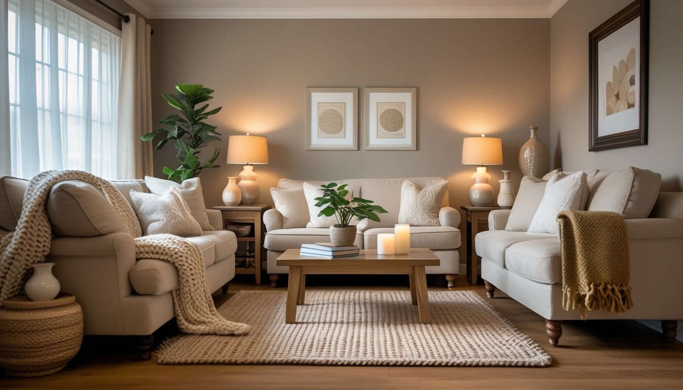
Greige gives you the perfect foundation for a space that’s inviting but never dull. This color bridges comfort and flexibility, making it a top pick if you want your home to feel relaxing and easy to decorate.
Balancing Warmth and Neutrality
What makes greige special is how it seamlessly blends the soft earthiness of beige with the refreshing calm of gray. You get the cozy vibes of a warmer color, but without things getting too golden or overwhelming. This balance means your room feels both inviting and open.
Greige’s versatility allows you to pair it with bold accent colors or keep things subtle with whites and woods. It’s a color that plays well with touches of brass, woven textures, or even pops of navy.
Here’s how greige stacks up:
| Feature | Benefit |
|---|---|
| Subtle undertones | Adds visual depth |
| Medium lightness | Keeps rooms bright, not stark |
| Adaptability | Works with any decor style |
Because greige has both warm and cool notes, your room stays comfortable through every season. You won’t feel boxed in by trends, and you can swap out accessories without repainting.
Greige vs. Beige and Gray
Choosing between greige, beige, and gray comes down to the atmosphere you want. Beige can sometimes look too yellow or old-fashioned, especially in low light. Gray might feel overly cool or clinical, leaving a space less inviting.
Greige steps in as the best of both worlds. You get warmth—without the yellow tones—and a feeling of modern freshness without the cold edge of gray. This means your walls become a backdrop that supports all your design choices, from rustic accents to modern fixtures.
Greige also ages gracefully. Unlike beige and gray, it tends not to clash with changing decor or new furnishings. So, when you want a room that feels cozy, modern, and easy to update over time, greige delivers solid results.
Top Warm Greige Paint Shades
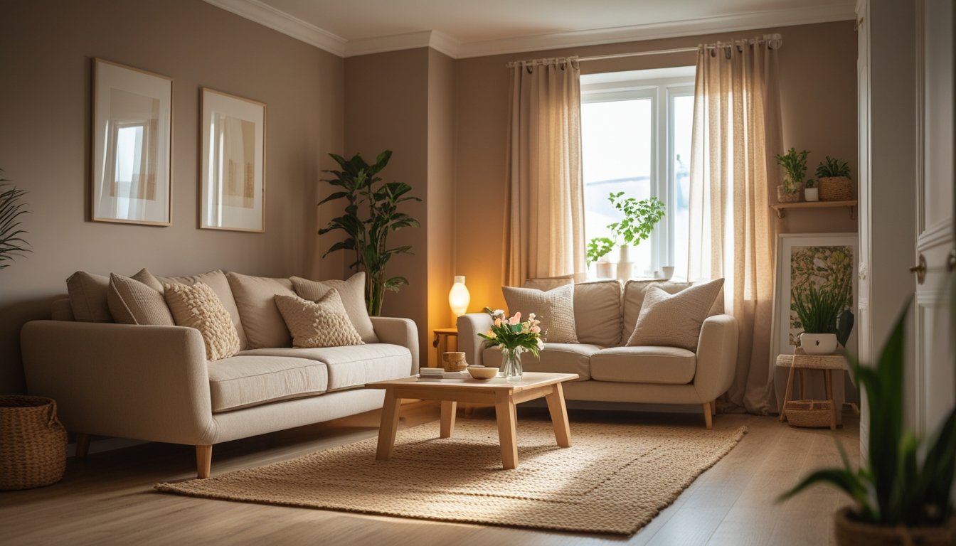
If you want your home to feel inviting, the right greige paint shade is key. Each depth of greige can change how your room feels, from light and airy to rich and dramatic.
Light Greige Paint Colors
Light greige tones are like a breath of fresh air in any space. They reflect plenty of natural and artificial light, keeping rooms feeling bright but soft. These shades work well in smaller bathrooms, open plan living areas, and bedrooms where you want to maintain a sense of openness.
Fan favorites like Benjamin Moore’s “Classic Gray” and Sherwin-Williams’ “Agreeable Gray” offer a subtle warmth that never feels yellow or cold. They’re excellent if you want walls that quietly complement a range of woods, metals, or colorful décor. Light greiges hide dust and minor scuffs better than true whites, making them practical for high-traffic spots, too.
| Paint Name | Undertone | Best For |
|---|---|---|
| Classic Gray (BM) | Slight taupe warmth | Bedrooms, hallways |
| Agreeable Gray (SW) | Gentle beige warmth | Living, dining rooms |
| Pale Oak (BM) | Soft, muted tan | Whole-home consistency |
Medium Greige Paint Tones
Medium greiges bring a little more depth and highlight architectural features beautifully. These shades are perfect if you want something cozier than a light neutral, but don’t want to go fully dark.
Paints like Sherwin-Williams’ “Repose Gray” or Behr’s “Greige” are steady choices with a comforting warmth. Medium greiges are especially good in spaces with good daylight, like kitchens, where they balance light and shadow. They also make open floor plans feel more connected and inviting.
| Paint Name | Undertone | Best For |
|---|---|---|
| Repose Gray (SW) | Soft, taupe-gray | Kitchens, entry |
| Balboa Mist (BM) | Warm greige | Family rooms |
| Greige (Behr) | Subtle brown | Multi-use spaces |
Deep Greige Shades
If you love drama or want to cozy up a large room, deep greige shades might be your best match. These deeper colors feel rich and earthy, working especially well in studies, dining rooms, or any spot you want to feel intimate and grounded.
Look for options like Benjamin Moore’s “Chelsea Gray” or Sherwin-Williams’ “Dovetail”. Their deep undertones complement matte black fixtures and natural stone. When paired with soft textiles, deep greiges create an enveloping effect without going too dark or overwhelming.
| Paint Name | Undertone | Best For |
|---|---|---|
| Chelsea Gray (BM) | Deep taupe-brown | Studies, dens |
| Dovetail (SW) | Moody brown-gray | Dining rooms |
| Urbane Bronze (SW) | Earthy slate warmth | Accent walls |
Try these shades on a few walls and see how they shift in changing light—a test spot can reveal little surprises with greige!
Expert-Recommended Greige Paint Brands
Not every greige is created equal—certain brands have earned top marks for their reliability, variety, and classic finishes. You’ll find fan-favorite colors, subtle undertones, and application that’s as smooth as your favorite latte.
Benjamin Moore Greige Picks
Benjamin Moore’s greiges are celebrated for their rich undertones and the subtle warmth they add to any space. “Revere Pewter” tops the charts with its balanced blend of gray and beige, making it a perennial designer favorite for living rooms and open floor plans.
“Edgecomb Gray” is another go-to if you’re after a slightly lighter, more versatile option that won’t overpower smaller spaces. Benjamin Moore paints are known for their superb coverage and durable finish, reducing touch-up needs.
A quick comparison table for you:
| Color Name | Undertone | Best For |
|---|---|---|
| Revere Pewter | Warm, earthy | Cozy living, open areas |
| Edgecomb Gray | Soft, neutral | Light-filled bedrooms |
These shades are easy on the eyes and adapt beautifully to changing light throughout the day.
Sherwin-Williams Greige Favorites
Sherwin-Williams offers a wide range of greige tones, but “Agreeable Gray” and “Accessible Beige” stand out. If you’re looking for a true crowd-pleaser, “Agreeable Gray” brings a soft, inviting feel that’s never too cool or too warm, perfect for almost any room.
“Accessible Beige” shifts slightly warmer and is ideal for spaces where you want a hint of coziness without darkness. Both paints deliver good coverage and consistency, which is especially helpful if you’re tackling a large project.
Sherwin-Williams is praised for its quality formulations that go on smoothly and dry evenly, giving you a professional finish even if it’s your first try.
Other Noteworthy Greige Paint Brands
Don’t skip brands like Farrow & Ball, Behr, or Valspar—they each bring something unique to the table. Farrow & Ball’s “Elephant’s Breath” is rich but never overpowering, perfect for accent walls or dining spaces where you want a touch of drama.
Behr’s “Silver Drop” is a popular pick for its subtle gray undertone, adding a modern feel without feeling cold.
- Farrow & Ball: Deep, sophisticated hues great for statement spaces.
- Behr: Wallet-friendly, widely available, and easy to apply.
- Valspar: Consistent performance and a wide selection of greige tones.
With these brands, you get options for every budget, project size, and desired vibe—all with the warm undertones that make greige so appealing.
How to Test and Select the Best Greige for Your Space
Finding the right greige means looking at how light, layout, and space size will impact the true color on your walls. It’s all about spotting how undertones show up differently in real life so your home feels just right.
Considering Natural and Artificial Lighting
Lighting totally changes how greige appears! Natural sunlight boosts warmer undertones, making some shades look more yellow or taupe. North-facing rooms tend to cool down a greige, while south-facing rooms often give it a soft glow.
Here’s a quick tip:
- Test sample swatches on every wall.
- Check them at different times of the day—morning, afternoon, and night.
- Use both daylight and regular room lights.
You also want to factor in your light bulbs. Warm white bulbs amplify creamy, beige notes. Cool white bulbs may bring out more gray or even a slight green. If you have mix-matched lighting (like recessed LEDs and table lamps), look at samples with both on.
A simple table helps track your favorites:
| Time of Day | North Wall | South Wall | Evening (Lamps) |
|---|---|---|---|
| 9 AM | |||
| 3 PM | |||
| 8 PM |
Mark how each sample shifts in different conditions!
Effect of Room Size and Layout
Room size changes how bold or subtle greige feels. In smaller rooms, a lighter greige keeps things open and airy, while deeper shades can suddenly feel moody or tight. Larger rooms can handle richer, warmer greiges without feeling closed in.
Notice how room layout and wall placement matter. If you have lots of doors, windows, or alcoves, the color will break up—sometimes making undertones pop in unexpected spots. An open floor plan means your greige needs to connect spaces nicely, so check samples on every wall, not just one.
Don’t forget ceilings and trim! Painting trim in a crisp white or a shade lighter than your greige can make everything look intentional and polished. Try a few sample boards in different areas to see how the layout affects the overall vibe before making your final call.
Pairing Greige Paint With Decor and Furnishings
Greige is famous for its versatility, giving you a flexible backdrop that works with a variety of colors and textures. The right pairings with decor and furnishings bring out its warmth and balance, making your space feel welcoming and cohesive.
Complementary Color Schemes
You can really unlock greige’s potential by matching it with the right accent colors. For a calm and inviting look, try pairing greige walls with earthy hues, such as olive green, terracotta, or burnt orange. These shades add richness and depth to the room.
If you want a more modern vibe, add in blacks, charcoals, or crisp whites. Don’t forget soft blues or sage greens—they create a soothing contrast that’s easy on the eyes. Here’s a quick cheat sheet:
| Greige Undertone | Best Accent Colors |
|---|---|
| Warm (beige-leaning) | Mustard yellow, Rust, Olive |
| Cool (gray-leaning) | Navy, Blush pink, Charcoal |
| Balanced | Teal, Clay, Cream |
Mixing metallics like brushed gold or matte bronze into fixtures or frames can add a bit of sparkle without overwhelming the softness of greige.
Textiles and Materials That Enhance Greige
The magic of greige goes beyond paint—it’s about layering textures to build warmth and comfort. Natural fibers like linen, wool, cotton, and jute work beautifully with greige walls. Toss a chunky knit throw or woven rug over your sofa for cozy vibes.
Wood tones are a perfect match for greige. Stick to medium or light finishes, such as oak or maple, so the look feels fresh and not too heavy. Try mixing in rattan accents, stone tabletops, and soft leather for added dimension.
You’ll notice how velvet cushions, patterned curtains, or faux fur pillows bring out the subtle undertones in your greige paint. Swap textiles seasonally—think lighter weaves in summer, layered knits in winter—to keep your space feeling inviting year-round.
Common Mistakes to Avoid With Greige Paint
Picking greige sounds easy, but it’s shockingly easy to go off track. One of the biggest mistakes is skipping the sample test. You might fall in love with a swatch under store lights but find it looks totally different at home in natural light.
Don’t ignore your room’s light exposure. North-facing rooms can make greige feel colder, while southern sunlight can crank up the warmth. Always check the paint at different times of day.
Choosing a greige with the wrong undertone is another common pitfall. Some greiges have a noticeable green, violet, or even pink undertone. Test out a few options to avoid unexpected color clashes.
Here’s a quick comparison table to help you keep an eye on common greige headaches:
| Mistake | What Happens |
|---|---|
| Skipping wall samples | Paint appears mismatched once dry |
| Overlooking undertones | Unwanted green, yellow, or pink tones show up |
| Ignoring natural light | The color feels stark or muddy |
| Forgetting about trim/floor | Paint competes with other room elements |
It’s also really easy to forget about your floors, trim, and furniture. Greige interacts with everything, and a great shade on the wall could turn weird if it doesn’t play nicely with your wood or carpet.
Go with your gut, but back it up with real-world testing. Paint is one of the easiest things to fix, but a little planning saves you a major headache down the line!